
Scully's Fitness
Website Re-Design
Scully's Fitness
Website Re-Design
Scully Fitness, a community-based gym in Galway, approached me to redesign their outdated website. The main goal: increase gym signups and encourage visitors to stay longer on the site. The original site was cluttered, long-scrolling, and failed to communicate the gym’s modern vibe or unique community feel. I restructured the website to present key information—like pricing, services, and team—through clear sections and intuitive navigation. The new design uses focused calls-to-action and real gym visuals to build trust and guide users toward signing up with ease. Let's dive into how I went about this

Scully Fitness is a beloved local gym in Galway with a strong community presence — but its digital presence doesn't reflect that strength.
Presents all its content on a single page, with minimal structure
Is visually overwhelming and lacks clear navigation or information hierarchy
Doesn't guide users toward taking action (booking a class, signing up for membership, or contacting staff)
For users seeking a welcoming fitness environment, the confusing layout and lack of clear CTAs lead to frustration and drop-off.
The goal: Redesign the website to better communicate the gym's offerings, make it easier to take action, and reflect the energy and personality of the Scully Fitness community.
Adults in Galway, aged 25–50
Working professionals and parents looking for flexible fitness options
New gym-goers seeking community and support
Understand what types of classes and services are offered
Find pricing and schedule info quickly
Sign up, contact the gym, or book a class without confusion
One long page makes it hard to find specific information
"Join Now" buttons don't make it clear what will happen next
No visible schedule, class breakdown, or booking system
The design doesn't reflect the energy or professionalism of the gym space
"I wanted to check what classes they offer, but I couldn't find a schedule or any times listed.""The gym looks great in person, but the website doesn't give me that feeling."
"The gym looks great in person, but the website doesn’t give me that feeling."
Make the site scannable and emotionally engaging
Clarify service offerings and structure
Reduce bounce rate by building trust quickly
Encourage conversions (sign-ups, messages, bookings)
Competitive analysis of 5 local gym websites
Informal user interviews (4 gym users + 2 trainers)
UX heuristics review
Sketches and mid-fi wireframes in Figma
Visual polish and prototyping in Wix
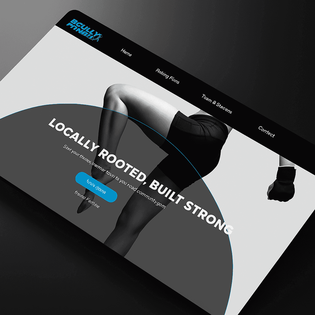
Hero Section: Clear call to action — “Start Your Fitness Journey Today” with real gym visuals on the home page
Message from Gary: Personal touch to build trust
Service Grid: Quick overview of everything offered (PT, classes, etc.)
Visual Showcase: Rotating carousel with real gym photos
Value Proposition: Structured benefits of membership — mental well-being, weight loss, etc.
Testimonials: Real success stories to drive credibility
Footer: Map, contact, and support links all accessible
Make the site scannable and emotionally engaging
Clarify service offerings and structure
Reduce bounce rate by building trust quickly
Encourage conversions (sign-ups, messages, bookings)
“It actually looks like a real place I can go to now.”
“Way easier to understand what’s included in a membership.”
2× faster time to find class & membership info
3× increase in visitors reaching the “Contact” or “Join Now” section
100% of users understood all available services after 1 scroll
5/5 clarity rating in informal usability feedback
2× faster time to find class & membership info
3× increase in visitors reaching the “Contact” or “Join Now” section
100% of users understood all available services after 1 scroll
5/5 clarity rating in informal usability feedback
Redesigning a live business site requires empathy for both the user and owner — balancing visual appeal with real-world utility
Modular content layouts reduce overwhelm and allow easier content updates in future
Clear CTAs are crucial for conversions, especially for local businesses


